Header and navigation
To customize the header, select “Header” in the left sidebar of the Theme Editor. Then use the settings from the header sidebar, which may be located on the right side of your screen if you're using a large display.
To add an announcement bar, social icons, or language and currency selectors in the header, you must rather customize the announcement bar section.
Styling pro tip
Before trying out the various header layout options, it’s best to first have your navigation ready so you’ll have the most accurate preview. To create your navigation, you must exit the Theme Editor and use the drag-and-drop tool from the Shopify admin to organize menu items and submenus. This is located under Online store. Learn more.
Understanding the navigation in the theme
Shopify supports up to three levels of menu items in the navigation (submenus). The structure of your navigation is determined by how you build it in the Shopify admin, but the layout is customized in the Theme Editor. Unless the “Layout on large screen” is set to an option that involves a collapsed menu (or “Hamburger”), the first level will be displayed by default in the header. The second and third levels will then be either laid out as cascading dropdowns, or as a “Mega menu”. The mega menu is a larger dropdown that allows to display all the links so that the user gets a bigger overview of the navigation in one click. This type of layout is especially useful for stores with a large number of menu items and/or menu categories. But one option is not better than the other. It all depends on the structure of your navigation and the shopping experience you want to provide to your customers.
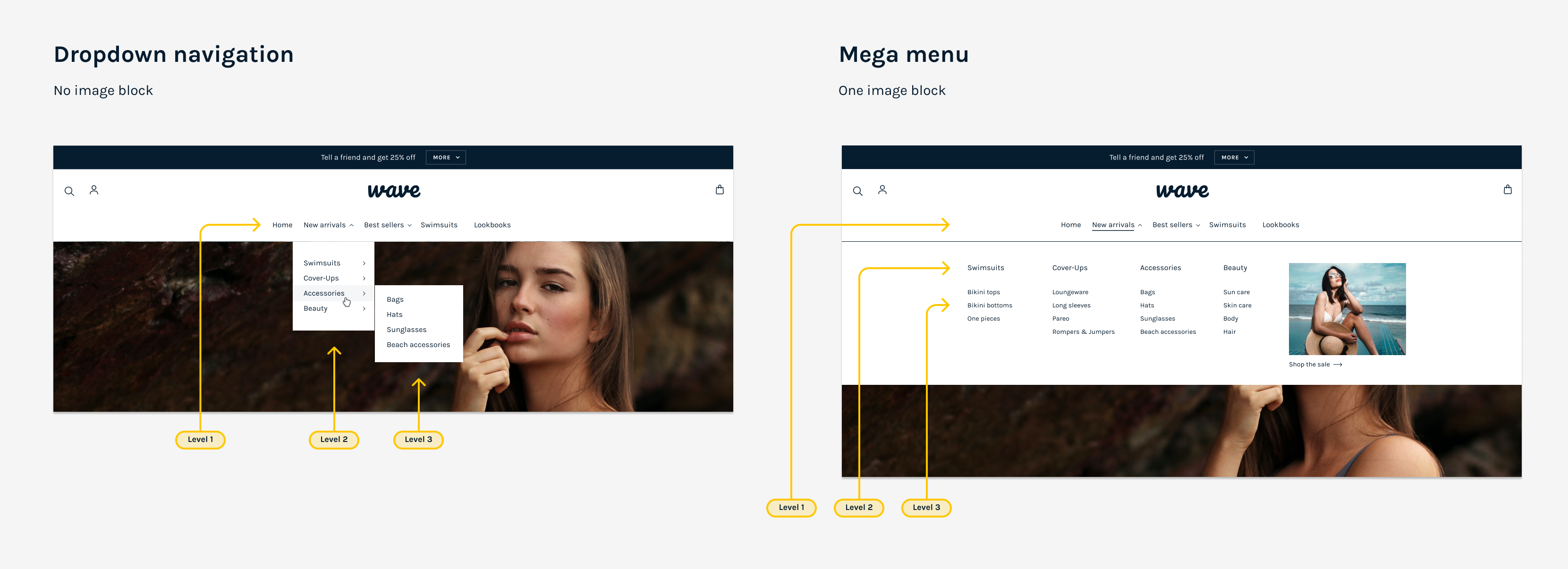
Mega menu
By default, the navigation on large screen displays cascading submenus. You can enable the mega menu in the header settings. The mega menu is also required if you want to display images in the navigation.
To enable mega menus, you must go to the main sidebar on the left of your screen and find the Enable mega menu input field. Type in the label of the 1st level menu item that will support the mega menu. You can type in multiple labels, separated by a comma. Make sure the spelling is an exact match otherwise it will not work.
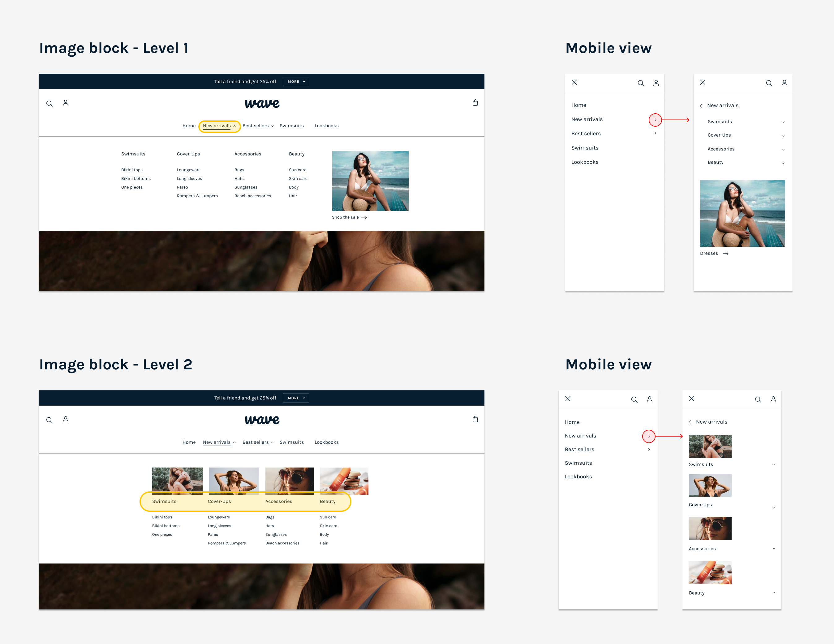
To add images inside the navigation, add an “image” block under “Header”. In the image settings, you must also associate your image to a menu item from the 1st or 2nd level for it to be displayed. You must make sure the spelling is an exact match with the label of the menu item you want it to be associated with. You must also respect the following convention depending if the menu item is from the first or second level.
1st level: e.g. Women
2nd level: e.g. Women > New arrivals
If the menu item is from the first level, the image will be displayed on the right side of the mega menu. This is useful to promote a product or a collection, or to give this category of links a cover image. If you associate the image to a menu item from the second level, the image will then be displayed inside your navigation. This is useful, for instance, when you want to give each collection a visual reference. More than one image block can be added to the header by clicking “Add image” multiple times, but only one image per second level menu item is supported.
Styling pro tip
Use images of the same aspect ratio for best results. You can crop your images to edit their aspect ratio before uploading them to Shopify, using Photoshop or any other image editing tool. There are also many free and simpler tools, such as I love IMG, which don’t require any software installation.
Optional sidebar menu
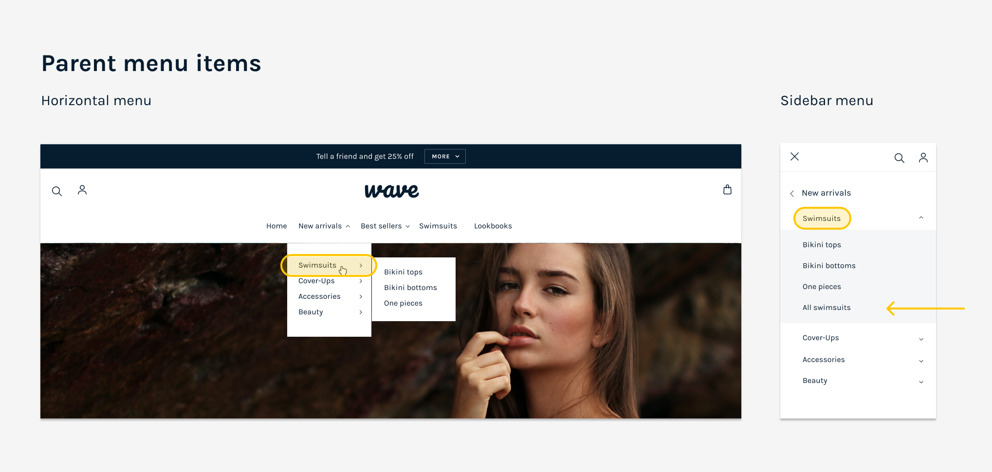
The sidebar menu appears on mobile, and when the “Layout on large screen” is set to a collapsed menu. It can be assigned a different navigation menu. This may be useful when you want to provide interactions for the mobile users that are otherwise accessible by mouse hover on large screen. For example when parent menu items are also links. A “parent” menu item is one that has another level below (the “children” menu items). On desktop, children can be accessed by hovering the parent. If the parent also has a link, it will be functional on click as well. On mobile though, those links are dismissed because tapping the parent is required to access the children. A workaround is to provide an explicit link “among the children”, such as “View all”.
Logo
To add a logo, use the first image selector labeled as “logo”. If you enable a header style with transparency, the theme will override the default logo image with the alternate logo when applicable. This is useful because the color of the header foreground elements may change depending on the background on which it is laid out. For instance, a default header with dark links and icons may switch to white when displayed with transparency over a background image, or over a section with a dark background. This ensures good legibility so your navigation always remains usable. A good practice would be to upload a white version of the logo in the “Alternate logo” selector for it to be visible when overlaid over a dark background color or image.
Styling pro tip
Best results may be achieved with transparent PNG images for the logos. Especially when enabling a transparent header style.
Header style
You can select a header style that has transparency. This can give your store an interesting art direction with great visual impact if it’s the desired effect.
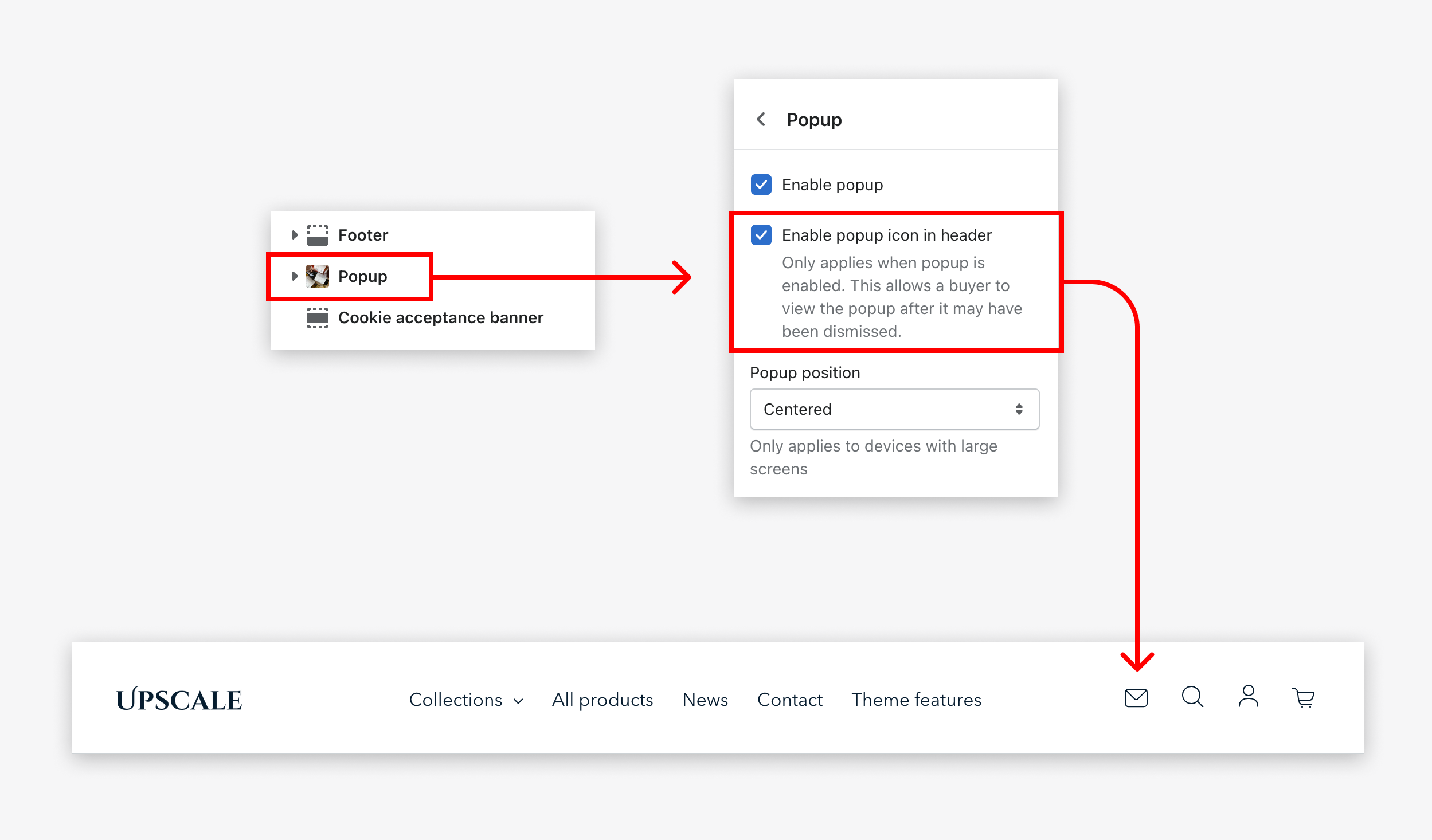
How to display the email icon in the header?
The theme allows you to display a newsletter icon in the header of your store so that your users can easily access the sign up form popup at any time. To enable this icon, you must go to the popup settings and enable the corresponding check box. The popup settings are located near the footer, in the left sidebar of the Theme Editor. Find more informations about the popup in this article.