Image size and image cropping
Image cropping
Image cropping is a common struggle, especially with full-width sections. As of today, the Shopify platform does not provide a native feature to do some basic image editing like manual cropping. But they recently introduced a way to set the focal point on an image, which should solve cropping issues in a lot of cases. Still, it is sometimes difficult to make sure the important part of your image remains visible at different screen sizes. In the theme, you will often come across image settings that help you control how your images will be displayed. Those settings are often similar from one section to another and may help resolve most problems you may encounter with image cropping. If you still need to manually crop an image to get the layout you want, there are plenty of free online tools like iloveimg that can help. Just edit your image and upload it to the theme.
Styling pro tip
First off, it's important when you customize your theme to make sure it looks good on both large and small screen sizes. You can easily preview the layout at different screen sizes by toggling the “Computer screen” icon on the top right corner of the Theme Editor. Luckily, the theme often provides separate image settings for large and small screen sizes which will give you additional control on your layout. Note that the the images always fill their container, and the focal point is in the center by default. This also explains why cropping may occur.
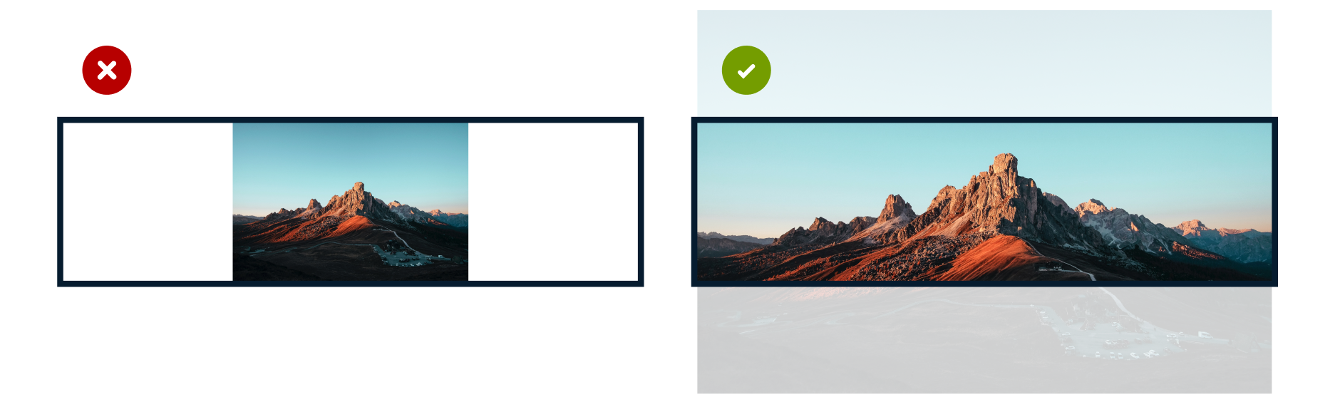
Image ratio is the key
When you add an image to your store, its aspect ratio is what determines how it will be cropped. Because images are centered in their container, cropping will occur on either the left and right sides, or top and bottom. As explained in the Collection image article, that is why it is recommended for collection cards to use images that have an aspect ratio that is close to a square (or with a portrait ratio). But for other images in the layout, like horizontal background images in the collection headers, a landscape type of ratio is preferred. This can make it difficult when the same resource (ex: the collection cover image from the admin) is leveraged by the theme for the 2 different purposes. For that reason, in this particular case, it is recommended to use images that have a square or portrait ratio. And then the cropping challenge in the collection header section can be overcome with the image override option. This ensures that you have the optimized image for both purposes. Note that making this image dynamic based on each collection requires using metafields. Learn more about that in the Collection page article.
Section width matters
In most sections, you will not only find a Section height setting, but also a Layout setting that allows you to choose Full width. For sections like the Hero that support a background image, this means that the image will be displayed edge-to-edge of the screen. This also means that when viewed on very large screens, you may be surprised by the end result and how the image gets cropped. Make sure to use images that are optimized for that use case. When the layout is set to a fixed width, it is easier to control how your image will be displayed.
*Bellow is a demonstration of how the section width impacts the image cropping when viewed on a large browser window:

Section height
When a section or image is set to a Small, Medium, or Large height, the height of the image featured in that section will be impacted. It is likely that there will be some cropping because the image fills its container. In some cases, an additional section height setting named Adapt to image is available. This will help reduce unwanted image cropping depending on the aspect ratio of the images you upload on your theme.

Styling pro tip
Remember that the image height may vary depending on how long is the text featured in the same section. This is because the theme will adapt the layout to prevent awkward results and colliding elements.